
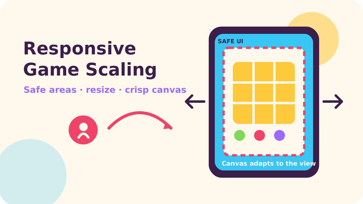
For a web game, choose a logical playfield first, then decide whether each device letterboxes it, crops it to fill, or expands the visible world. Size the canvas from its container with ResizeObserver, cap high-density rendering when needed, and keep controls inside CSS safe areas; mobile browser bars and orientation changes make a single fixed screen measurement unreliable.
Key takeaways
- Use letterbox scaling when every tile, lane, or puzzle piece must remain visible; use fill only when cropping is safe; use expand when extra world space is a feature.
- Separate CSS-pixel layout from canvas backing-store pixels, and treat
devicePixelRatioas a quality/performance setting. - Observe the game container, not just
window, and apply resize work on the next animation frame. - Use
dvhfor a browser-height shell that should follow changing browser bars; usesvhwhen avoiding movement matters more. - Let backgrounds reach the screen edge, but protect buttons and text with
env(safe-area-inset-*).
Start with the playfield, not the device list
Responsive scaling is easier when the game has a stable coordinate system. A portrait match board might use a logical width and height that never change, regardless of whether the phone is narrow or tall. Rendering then maps that design space to the available canvas. The camera or layout policy decides what happens to any mismatch.
That distinction matters for casual games. A player should not see a match board’s bottom row clipped because a browser toolbar moved, nor should a fast arcade game suddenly shift its controls when an address bar retracts. If the game is a wide field with optional scenery, however, letting landscape screens reveal more ground can feel natural. Our experience-informed rule of thumb is to decide what must stay visible before picking a scaling formula.
Which scaling strategy should you use?
Letterbox: preserve the whole composition
Letterbox, also called contain, scales uniformly until the entire logical playfield fits. The leftover area becomes bars, framing art, or a calm background. This is a strong default for fixed-board puzzles, card layouts, and games whose HUD positions are authored as part of one composition. The cost is unused space, especially when a tall portrait game appears in a wide browser window.
Keep the canvas centered and paint the surrounding stage with a deliberate color or decorative pattern. Avoid stretching the canvas independently in each direction: distorted circles and squashed characters are immediately visible in a candy-style game.
Fill: use the whole viewport and accept cropping
Fill, or cover, scales until the available area is covered. It removes bars but trims content on one axis. It suits backgrounds, decorative scenes, and games where the camera can safely crop scenery. It is risky for score labels, targets near the edge, or any puzzle where all cells must remain available.
You can cover the background while containing the interactive board, letting scenery bleed off-screen while controls remain reachable.
Expand: reveal more of the world
Expand keeps the chosen scale and makes the visible world larger on wider or taller screens. It works well for endless runners, platformers, and arcade arenas with flexible scenery. It is less suitable when extra visibility changes difficulty, reveals future obstacles, or creates a competitive advantage.
For a fixed grid, expansion can add margins rather than change tile size. For a runner, reveal more scenery while keeping the player anchored; cap world bounds if the widest view reveals too much.
- Choose letterbox when all authored content must fit.
- Choose fill when edge cropping is harmless or desirable.
- Choose expand when additional viewable world does not alter fairness or pacing.
- Mix policies when the background and interactive layer have different needs.
These choices appear across different kinds of casual games. A contained board can suit a game like Blot Up Ink, while scenery-led arcade action can make better use of expansion. The right policy follows the rules of play, not a universal “mobile-first” formula.
Build canvas pixels from a measured container
CSS pixels describe layout; the canvas width and height attributes describe its drawing buffer. If those values are too small, the browser stretches a low-resolution image and the game looks soft. If the backing store is needlessly huge, fill rate and memory use rise. MDN describes devicePixelRatio as the ratio between physical pixels and CSS pixels, and its canvas example scales the backing store then scales the drawing context.
Use the actual game host as the size authority. A parent panel, split-screen layout, or embedded game can change size without a useful window resize. MDN describes ResizeObserver as a way to receive notifications when an element changes size. The 2025 Chrome for Android edge-to-edge announcement is a timely reminder that even browser-level display boundaries are shifting: from Chrome 135, content can extend into the gesture navigation area on eligible small screens.
const host = document.querySelector("#game-host");
const canvas = document.querySelector("#game");
const ctx = canvas.getContext("2d");
let pendingSize;

const observer = new ResizeObserver(([entry]) => {
  pendingSize = {
    width: entry.contentRect.width,
    height: entry.contentRect.height
  };
});
observer.observe(host);

function frame() {
  if (pendingSize) {
    const { width, height } = pendingSize;
    const scale = Math.min(window.devicePixelRatio || 1, 2);
    canvas.style.width = `${width}px`;
    canvas.style.height = `${height}px`;
    canvas.width = Math.round(width * scale);
    canvas.height = Math.round(height * scale);
    ctx.setTransform(scale, 0, 0, scale, 0, 0);
    resizeGame(width, height); // update camera/layout in CSS pixels
    pendingSize = null;
  }
  renderGame(ctx);
  requestAnimationFrame(frame);
}
requestAnimationFrame(frame);
“The Resize Observer API provides a performant mechanism by which code can monitor an element for changes to its size”
— MDN, Resize Observer API
This is a minimal pattern, not a full renderer. resizeGame and renderGame stand for your own engine functions. The cap of two is a tunable policy, not a browser requirement; use a lower cap on fill-heavy scenes or let a quality setting choose it. If your engine already owns the canvas backing store, feed it the measured CSS dimensions and pixel ratio rather than setting attributes behind its back. Setting canvas.width resets the context state, so restore transforms, smoothing, and drawing styles after a buffer resize.
Use orientation changes only when game rules or HUD arrangement must switch; the observer reports the resulting dimensions. Coalesce events so rotation triggers one layout pass.
Use viewport units with a specific job
The familiar 100vh has historically described a viewport size that can extend behind mobile browser controls. Newer units let CSS express intent more clearly: svh is based on the small viewport with browser UI present, lvh on the large viewport with UI retracted, and dvh changes as that UI expands or collapses. Chrome’s CSS guidance notes that dynamic viewport units respond to browser toolbars and do not account for the virtual keyboard.
An in-page game shell can use dvh with a fallback:
.game-shell {
  height: 100vh;
  height: 100svh;
  display: grid;
  place-items: center;
  overflow: hidden;
}
@supports (height: 100dvh) {
  .game-shell { height: 100dvh; }
}
“Dynamic viewport units change in value when the additional dynamic browser toolbars, such as the address at the top or tab bar at the bottom, are visible and when they are not.”
— Chrome for Developers, What’s new in CSS and UI: I/O 2023 Edition
Choose svh if the game should never jump as browser chrome animates, and accept that a little space may remain when the bars hide. Choose dvh if using every currently visible pixel is important, while expecting the canvas to resize as the browser changes its chrome. Avoid animating critical gameplay geometry in response to every toolbar frame; defer or smooth camera changes if that movement would distract.
Software keyboards need separate thought. Chrome’s viewport behavior article explains that mobile browsers may resize the visual viewport, resize both visual and layout viewports, or overlay the keyboard. Keep player-name inputs reachable, and test the keyboard rather than assuming viewport units shrink consistently.
Keep controls inside safe areas
Safe-area insets protect content from rounded corners, sensor cutouts, and system gesture areas. WebKit’s guidance pairs full-bleed layouts with selective padding for important content, and explicitly says safe-area insets are not a replacement for ordinary margins. That remains a useful mental model: let the artwork fill the display, then inset the pause button, score, and touch targets.
.game-shell {
  padding: max(16px, env(safe-area-inset-top, 0px))
           max(16px, env(safe-area-inset-right, 0px))
           max(16px, env(safe-area-inset-bottom, 0px))
           max(16px, env(safe-area-inset-left, 0px));
  box-sizing: border-box;
}
“Safe area insets are not a replacement for margins.”
— WebKit, Designing Websites for iPhone X
For safe-area values to be useful on devices that expose the full display area, the page’s viewport configuration may need viewport-fit=cover. That belongs in the host document’s head, not in the article fragment. Apply insets to controls rather than shrinking the canvas, or backgrounds may stop at the safe boundary.
Fullscreen is a request, not a layout guarantee
The Fullscreen API is useful where supported, but web games should remain playable without it. MDN marks requestFullscreen() as having limited availability, and its request can reject when permission or embedding policy blocks access. It also requires a user action. iOS browsers have different fullscreen capabilities for arbitrary elements than desktop browsers, so do not promise an identical experience across iPhone browsers. Offer a clear button where supported, handle promise rejection, and keep the in-page layout sound.
When fullscreen succeeds or ends, observe the host again and recompute scale, then verify focus and touch input. For a deeper web delivery discussion, see our HTML5 web games guide and mobile web game performance budget.
What changed recently, and what should you test?
“from Chrome 135, Chrome on Android can draw web content up to the bottom device edge by extending the viewport into the gesture navigation bar area.”
— Chrome for Developers, Prepare for Chrome on Android going edge-to-edge
Two recent browser items sharpen the checklist. Chrome’s “Prepare for Chrome on Android going edge-to-edge” (published in 2025) describes viewport extension into the gesture-navigation area on eligible devices. WebKit’s “WebKit Features for Safari 26.1” (published in 2025) reports a fix for a bottom gap with viewport-sized fixed containers on iOS. Neither changes the scaling mathematics, but both make real-device layout checks worthwhile.
Test the same build in portrait and landscape, with browser bars visible and retracted, and with fullscreen entered and exited. Include a narrow phone, a tablet-like ratio, and a desktop resize. Check safe controls, stable logical coordinates, and hit-testing at the render scale. If you ship a web version alongside iOS and Android, treat it as its own release surface; the constraints overlap, but the browser’s UI is part of the screen the player experiences.
“The `devicePixelRatio` of `Window` interface returns the ratio of the resolution in physical pixels to the resolution in CSS pixels for the current display device.”
In our experience, scaling bugs often come from mixing CSS size, canvas backing size, and logical game coordinates. Give each a name and conversion point. That discipline makes letterboxing predictable and orientation changes easier to debug. For teams planning a larger game rollout, our studio services page outlines the kinds of production support we offer. If you are weighing a specific web-game layout, talk with NabiGame Studio about the constraints you are working through.
FAQ
Should a puzzle game use letterbox scaling?
Usually, if every cell and control must remain visible and keep its size relationship. You can fill the unused space with a background or frame. If you expand the playfield, make sure additional visibility does not change the puzzle difficulty.
Is devicePixelRatio always the right canvas scale?
It is a useful starting point for sharper rendering, but it is also a performance choice. Cap or lower it for fill-heavy games and restore the canvas context after changing its backing dimensions.
Should I use dvh or svh?
Use dvh when the game should follow the currently visible viewport as browser bars change. Use svh when stable sizing matters more than occupying the extra space after bars retract.
Do safe-area insets replace padding?
No. Combine the inset with a minimum margin, for example with max(16px, env(safe-area-inset-bottom, 0px)). That keeps a control away from both the device edge and the unsafe system area.
Can I rely on fullscreen on iPhone?
No single fullscreen promise should be assumed across iOS browsers and embedding contexts. Keep the in-page game usable, request fullscreen from a user action where supported, and handle rejection or exit cleanly.
Sources
- “Prepare for Chrome on Android going edge-to-edge” — Chrome for Developers
- “WebKit Features for Safari 26.1” — WebKit
- “What’s new in CSS and UI: I/O 2023 Edition” — Chrome for Developers
- “Prepare for viewport resize behavior changes coming to Chrome on Android” — Chrome for Developers
- “Resize Observer API” — MDN
- “Window: devicePixelRatio property” — MDN
- “WebGL best practices” — MDN
- “Element: requestFullscreen() method” — MDN
- “Designing Websites for iPhone X” — WebKit

Comments
Loading comments…